An Ode to Helvetica

Fonts are a funny thing. Some people will go their whole lives without knowing the name of more than two fonts; others care enough to rant on the internet about the use of Papyrus for the title and captions in Avatar (there is also this *potentially satirical* letter from the font itself), or rage about the use of Comic Sans.
Whichever of these camps you fall into, it’s important to know that each font out there was designed with a purpose in mind. Even Comic Sans. Created for the comical voice of Microsoft Word’s helper, Bob, it was made to be friendly, light-hearted embodiment of the paper clip cartoon. Most of the backlash around Comic Sans (and sometimes Papyrus) relates to inappropriate uses, such as on an ambulance or warning signage. (Some examples here.)
Poor examples aside, when a font is used properly, it practically disappears into the design; this is a beautiful thing. Which brings us to Helvetica.
Swiss type designers Miedinger and Hoffmann set out in 1957 to create a neutral typeface that had great clarity, no intrinsic meaning in its form, and could be used on a wide variety of signage.
The modern Helvetica Neue is the perfect fit for Locus Research with its exact, geometric but not-too-geometric (dare I say, perfect?) letterforms, yet it leads itself to creative, professional design.
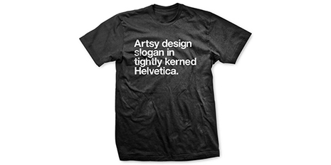
And also some less professional, but incredibly popular design.
*Side note – yes the LR logo is Helvetica Rounded, but I could write a whole other blog on rounded fonts. Stay tuned.
And we’re not the only ones who think it makes a great brand font.
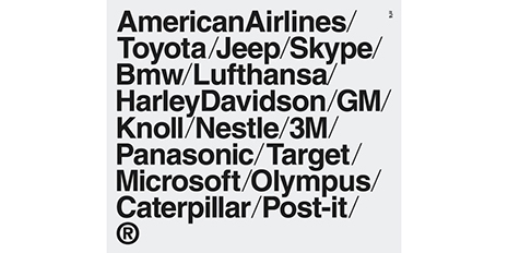
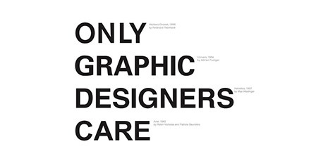
Each of these well known, global brands use Helvetica – did you notice before now? It can also be found in numerous movie and TV show titles, on all US government forms, and a wide variety of signage, including the NYC subway system. It has lived up to its intention as a well-designed, all-encompassing font that properly suits multiple purposes. Computer giant Apple even used Helvetica for a short time before converting to their own custom font, San Francisco. (I enjoyed the Helvetica era, no surprise there.)
And while there are other fonts that come close, somehow nothing feels quite as good as Helvetica.
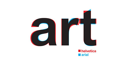
Helvetica’s generic cousin, Arial, was created for IBM and could be the digital embodiment of the Windows vs Mac debate. While the two are quite similar, the big difference lies in the ends of the stroke – Helvetica uses horizontal terminals where Arial’s are angled.
Somehow, it just doesn’t feel quite as resolved, not quite as perfect.
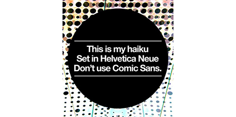
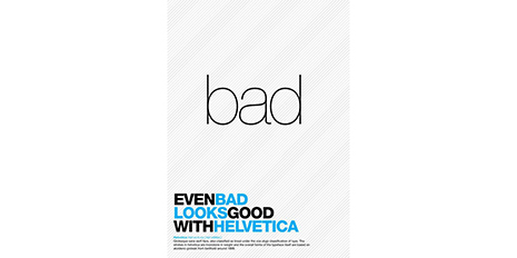
Thus, the odes to Helvetica are endless. You can download Helveticons so that your designs are unified down to the last edit icon. You can purchase a commemorative Moleskine notebook, or endless posters written in Helvetica. Or give in to your inner cat lover and buy this Helveticat poster (not written in Helvetica).
Will there ever be a font that is used so universally by designers and laymen alike? Some have speculated that Gotham is the new Helvetica (though perhaps too wide, too geometric, too trendy), but sometimes there is just no substitute.
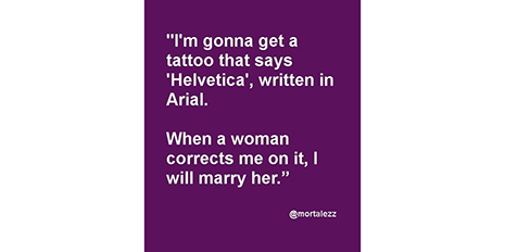
It’s just a shame this was written in Arial.
Want to read more on creativity, design, product development and innovation? Go to our Six Lenses Blog.
Comments